Senda is a digital wallet designed to help people living abroad send money home easily, securely, and with full control.
Context
This was a one-week design challenge to create a digital wallet from scratch. I led the full process, from research and ideation to branding and high-fidelity prototyping. The goal was to design a simple, secure way for people living abroad to send money home.
Problem Statement
Individuals and families living abroad often encounter high fees, complicated processes, and a lack of trust when transferring money to support their families back home. Current solutions can be expensive and confusing, failing to meet their actual needs, which makes each transfer feel stressful and uncertain. How can we create a simple, secure, and transparent wallet that empowers them to send money easily and confidently, anytime and anywhere?

Objective
Develop a simple, secure, and user-centered digital wallet that enables people living abroad to send money to their families effortlessly, with low fees, transparent processes, and a trustworthy experience; eliminating friction, confusion, and stress from the remittance process.
Goals
- Streamline onboarding & verification
- Enable multi-currency flexibility
- Simplify money transfers (SEPA & beyond)
- Support user autonomy
Opportunity
To become the most trusted, simple, and human way to send money home, offering control, support, clarity, and care.
Understanding the problem
The project began with deep research into the challenges faced by people sending money to their families abroad. We uncovered issues like high transfer fees, confusing processes, and low trust in digital services. Statistical data on immigration and remittances showed that funds are mainly used for food, education, and healthcare, highlighting the emotional weight of each transaction.
Synthesizing user insights
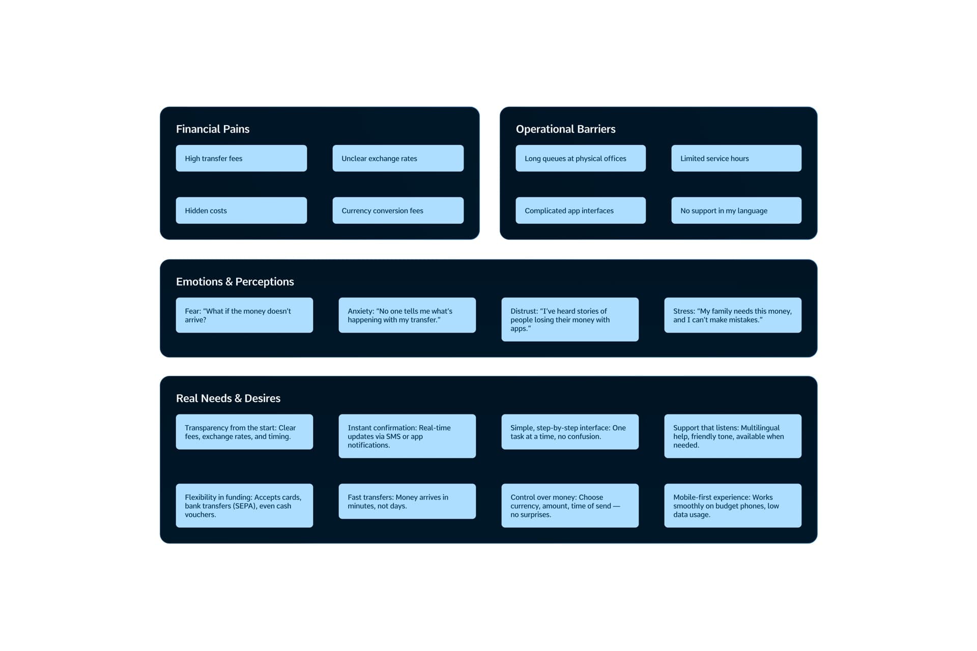
An Affinity Map helped cluster key pain points: financial, operational, and emotional; alongside real user needs: clarity, control, speed, and human support. These insights guided our focus toward creating an experience that removes friction and builds trust in every step.
Discovering the user
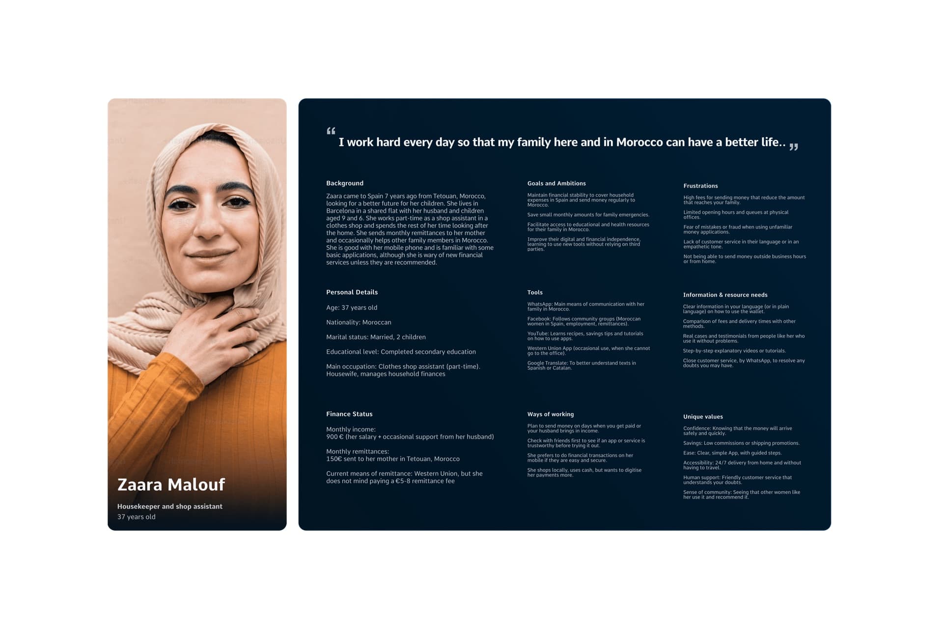
We created a detailed user persona, representing a working woman who manages both her job and family while sending monthly remittances. Her goals and frustrations shaped our user stories, which focused on easy mobile transfers, fee transparency, and language accessibility.
Benchmarking the competition
We analyzed apps like Western Union, Wise, Revolut, and Verse, identifying strengths (multi-currency, SEPA) and gaps (complexity, lack of cultural relevance). This revealed a clear opportunity for a solution that's simple, trustworthy, and designed for real-life support needs.
Mapping the User Journey
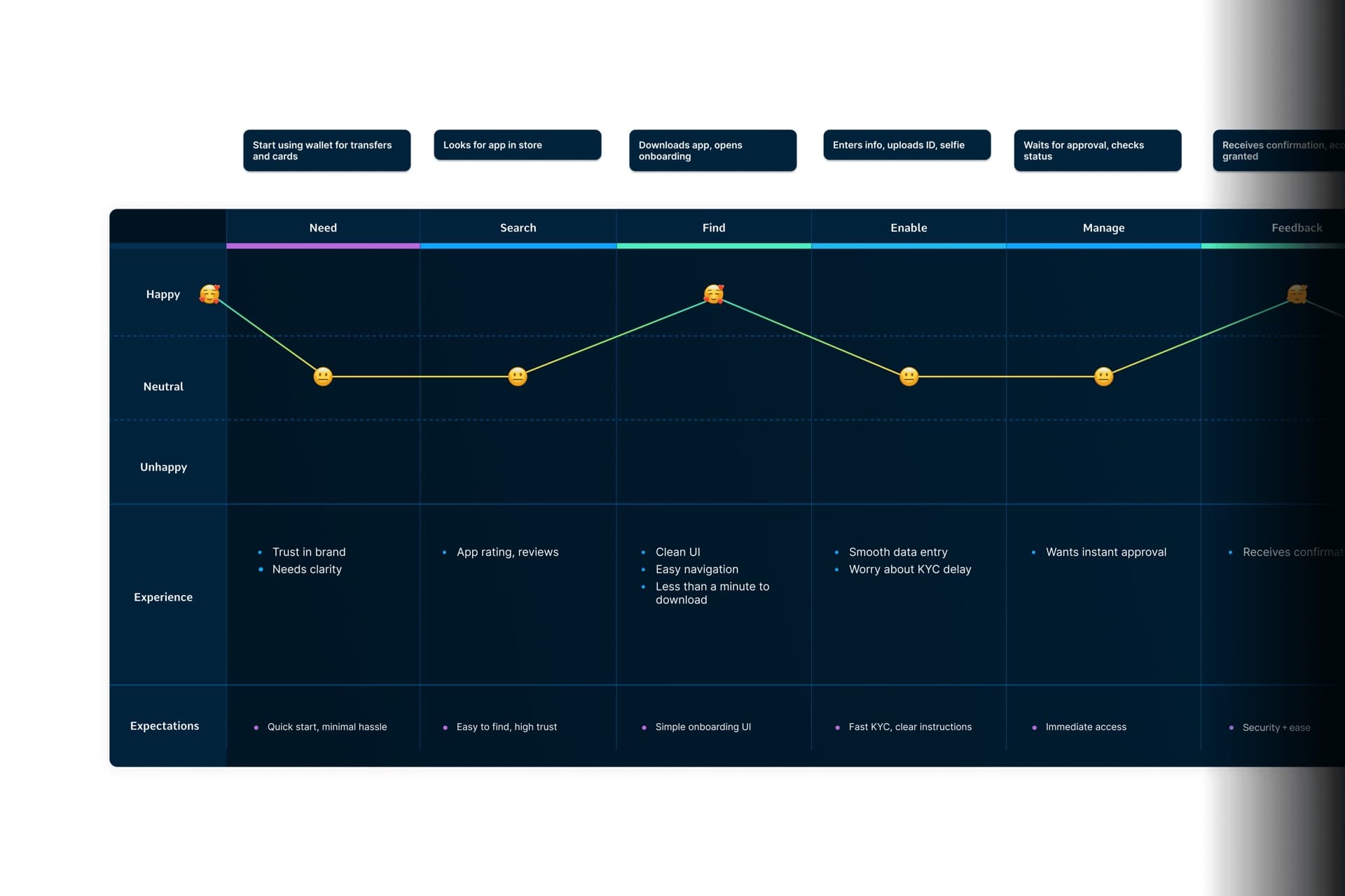
We mapped the end-to-end user journey, from onboarding to multi-currency card setup and SEPA transfers. Each step included user emotions, frictions, and expectations, allowing us to design a flow that delivers transparency, ease, and real-time feedback.
Branding & Visual Language
We defined Senda as a brand about connection, purpose, and care. The visual identity uses blue tones for trust, with soft, accessible typography and a logo representing a path, open arms, and family. The tone of voice is warm, clear, and supportive, avoiding complexity.
Designing the Experience
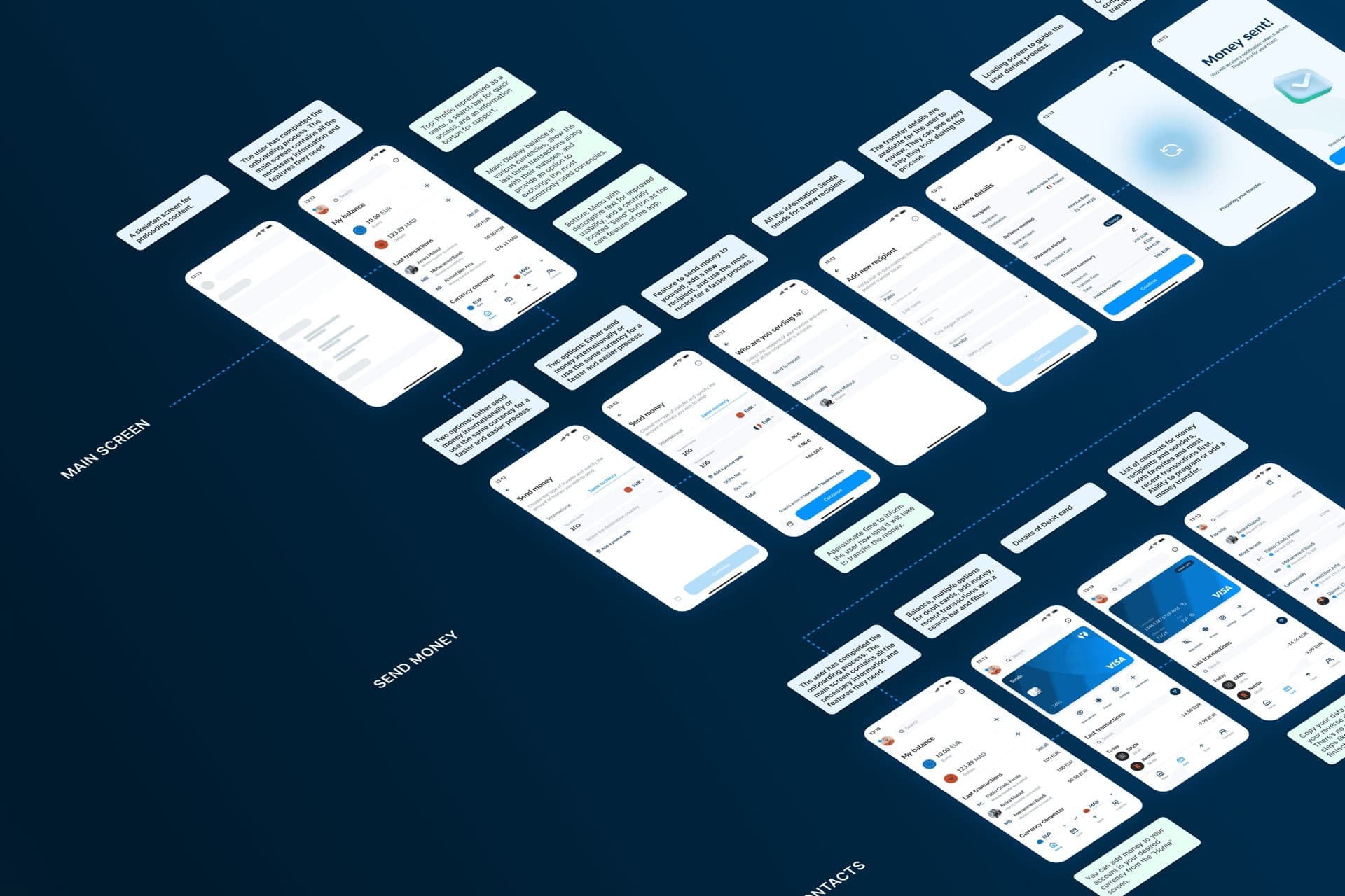
Through lo-fi wireframes, we structured flows for registration, ID verification, wallet funding, and money transfers, optimized for mobile and low data usage. In hi-fi screens, we prioritized clean layouts, step-by-step guidance, and reassuring microcopy for users with varying tech experience.
Final Prototype
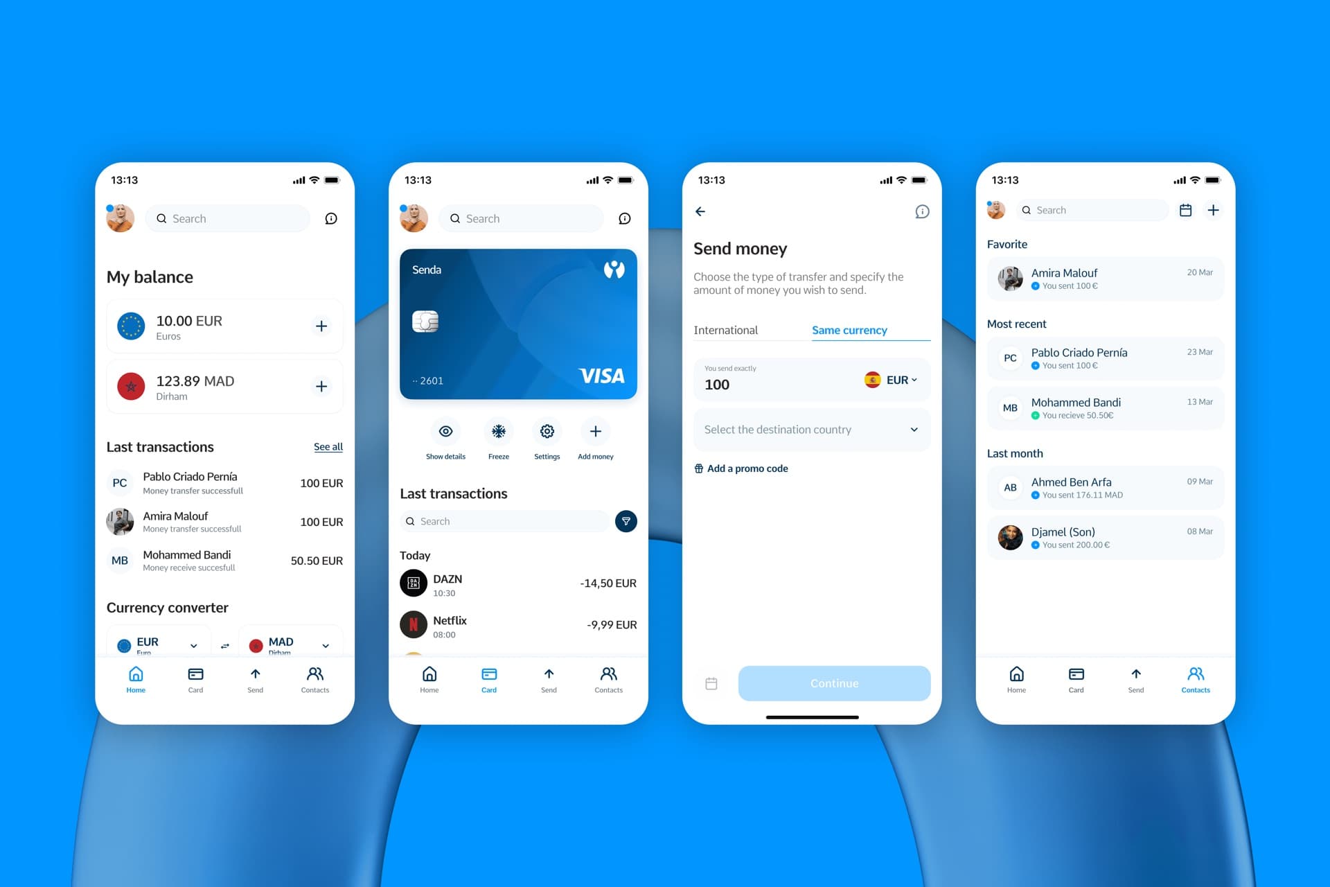
The final prototype delivers a seamless experience, from KYC onboarding to real-time SEPA transfers, including digital multi-currency card and list of contacts; every step with instant confirmation and full control over funds. Senda empowers users to send money easily and safely, offering a human-first financial tool tailored to their lives.
Senda simplifies how people support their families from abroad. This project pushed me to design fast, stay user-focused, and build a solution with real emotional and functional impact.
Conclusion
I'm really grateful for the chance to work on such an exciting and meaningful project. I've learned a lot along the way, especially about designing for real people and real needs, and it's been a pleasure to dive into something with so much purpose.
Next Steps
Validation & Iteration: The next phase involves user testing to validate if the proposed solution truly addresses user needs and delivers a seamless, trustworthy experience. Based on feedback, we will iterate to enhance onboarding, transfers, card setup... ensuring the product meets its core objectives.
Key Metrics to Track
- Multi-currency card activation rate
- KYC drop-off % per step
- Support requests per 100 transfers
- Average time from registration to first transaction
- Onboarding churn rate
- Number of transfers per user
- Average time to do a transfer
- Onboarding vs cards activation vs money added
Future Features
- Dark Mode
- User customization options (themes, shortcuts)
- Widgets for quick actions (e.g., send money, view balance)
- More currencies supported
- Premium Plans with added benefits (lower fees, priority support)

