Redesigned and refreshed Bayer Leverkusen's brand identity to unify the club's digital and physical presence with a bold, historically-rooted visual system.
Problem Statement
Bayer Leverkusen needed to address its brand's disconnection from modern football culture and its ambitious global growth, with an outdated identity that did not reflect the club's renewed competitive status and dominant recent performance.
Goals:
Design a bold, historically-rooted rebrand that honors heritage while being built for a modern, digital-first era, improving consistency and fan connection globally.
Objectives
- Establish a cohesive visual identity system
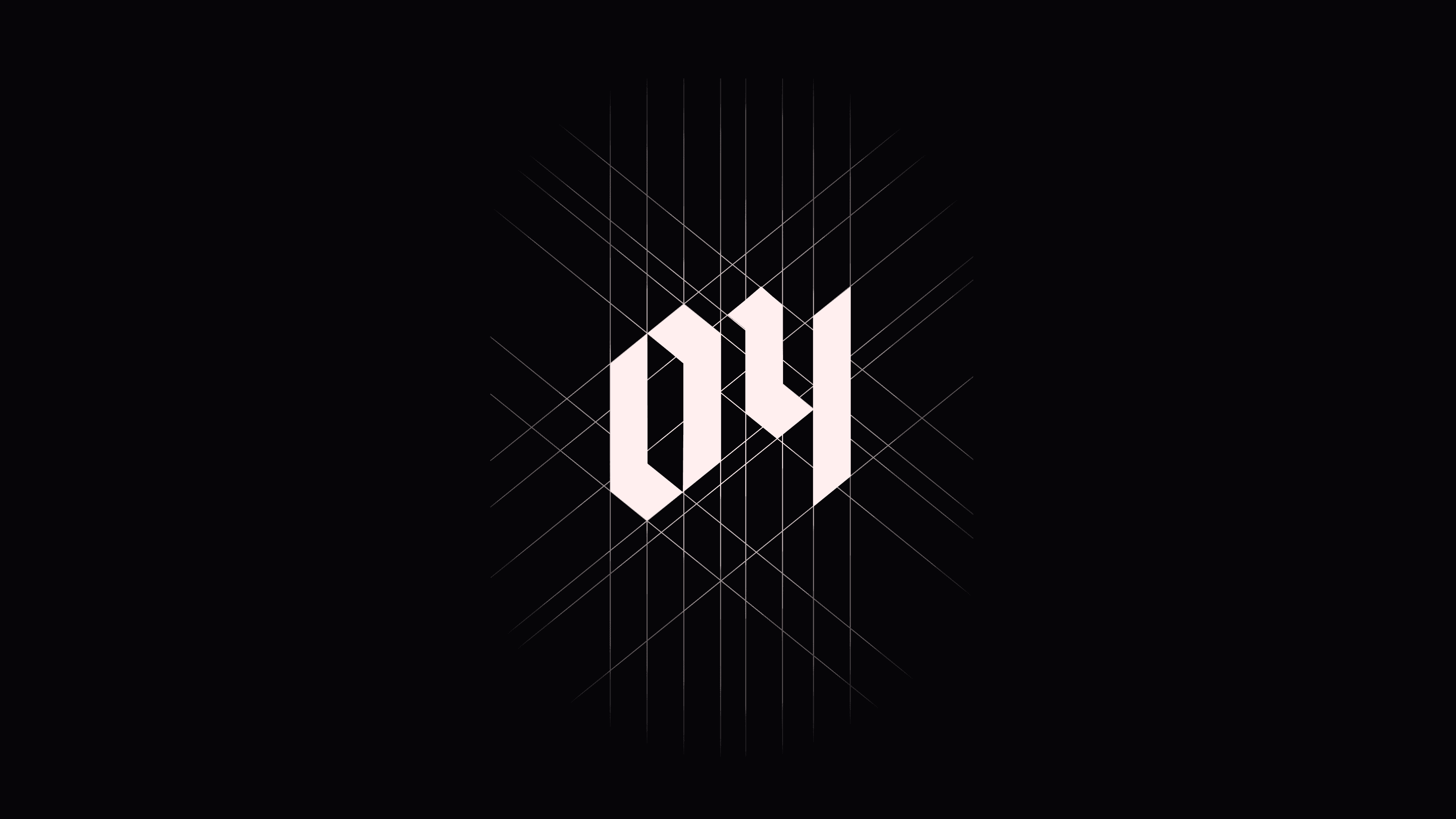
- Refresh typography rooted in blackletter tradition
- Create flexible design assets for digital and physical media
- Develop a kit design that reflects both heritage and modernity
Opportunity:
Leverage the club's historic title-winning season to reintroduce a stronger, more unified brand that resonates across digital platforms and global markets, capturing new fans while honoring the loyal base.
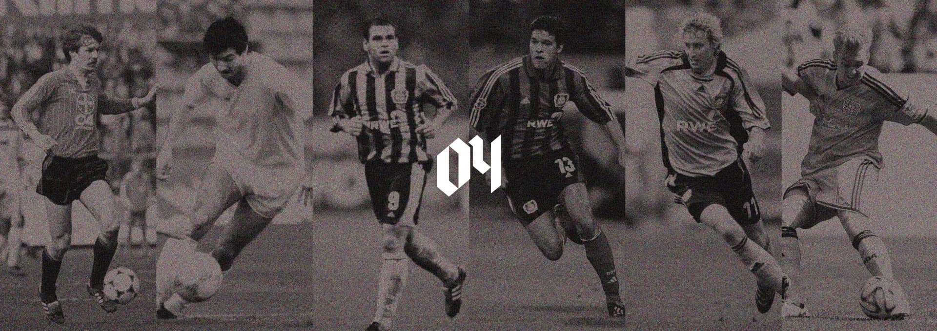
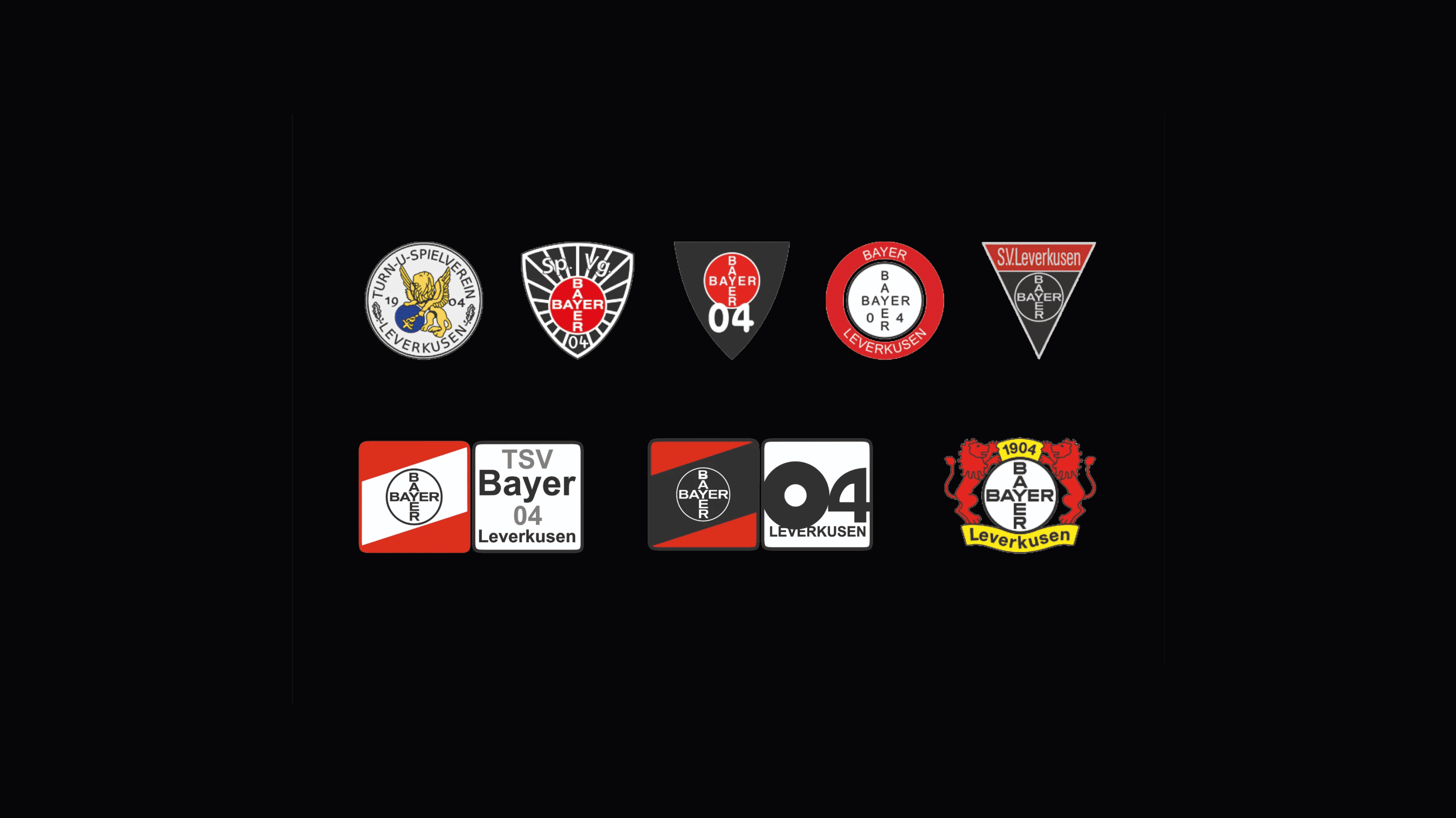
The visual system builds on heritage.
Key design principles applied:
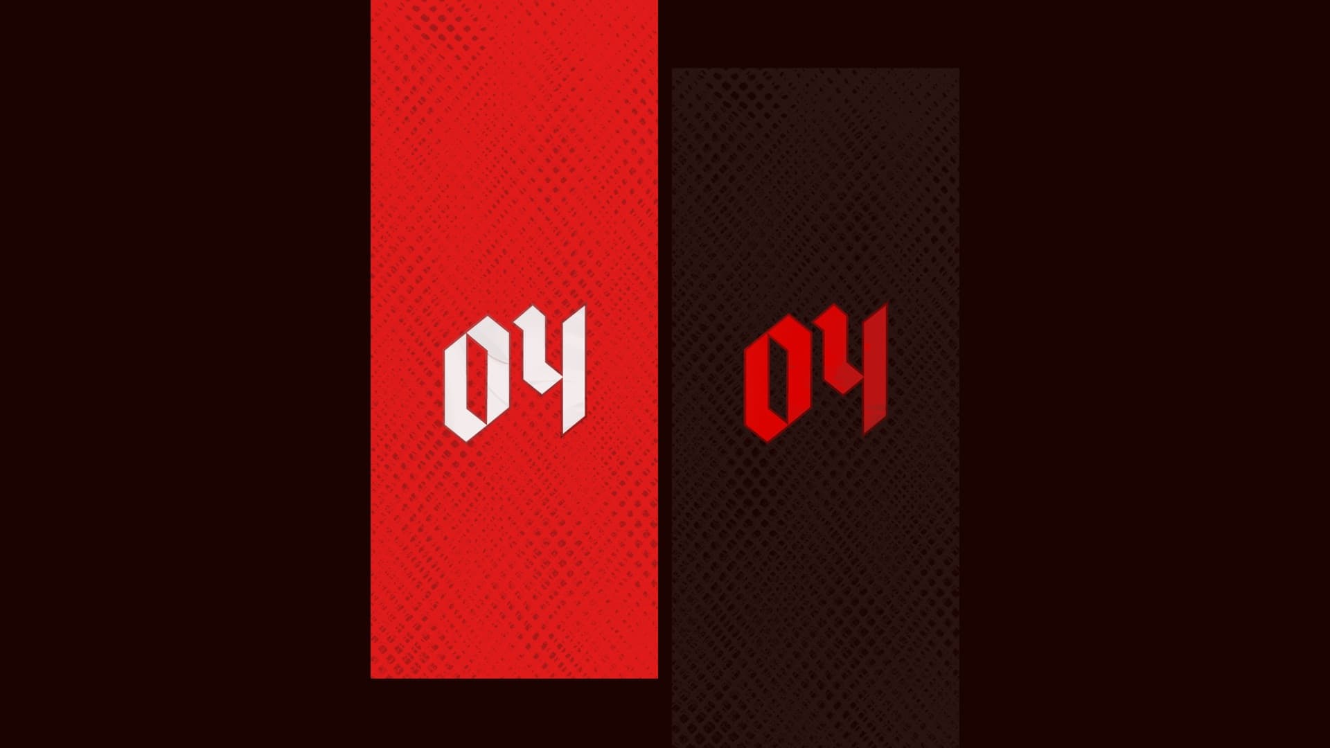
- Typography: A custom blackletter-inspired typeface that links to the club's historic roots while staying clean and legible for digital.
- Color palette: The club's iconic red and black with a refined tonal hierarchy for depth and contrast.
- Digital readiness: Minimal, clean, and flexible layouts optimized for social media and broadcast.
- Brand consistency: A unified system across digital applications, kits, and environmental design.
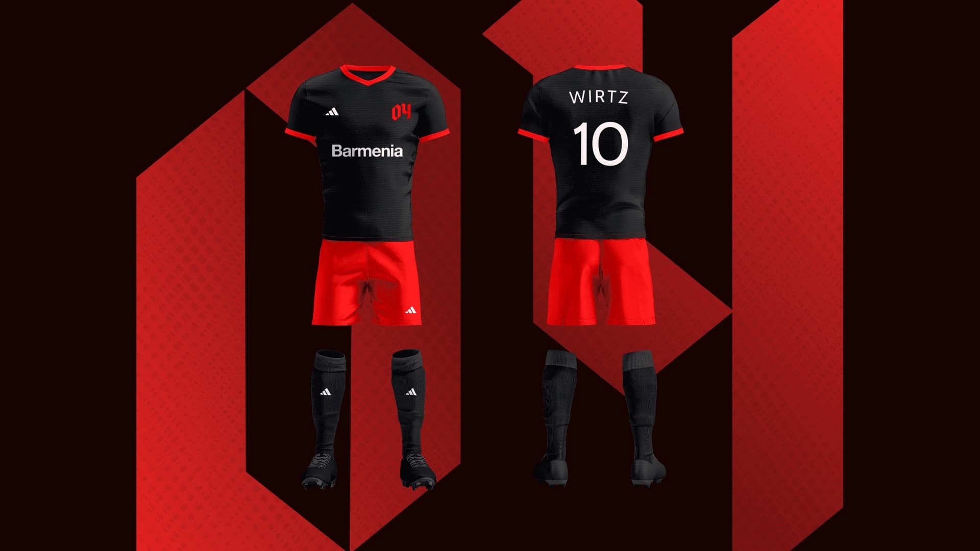
The jersey is a tribute to the club's heart and its city. A representation that embodies the spirit of Bayer Leverkusen, built for performance and identity.
The identity translates to kit design seamlessly, with bold use of blackletter on the back numbers and a clean, minimal front panel anchored by the new 04 mark.
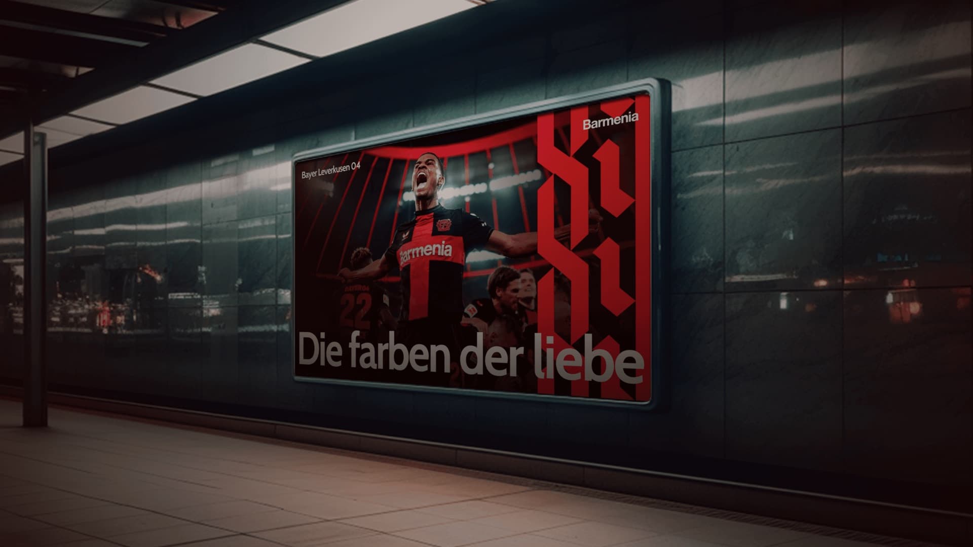
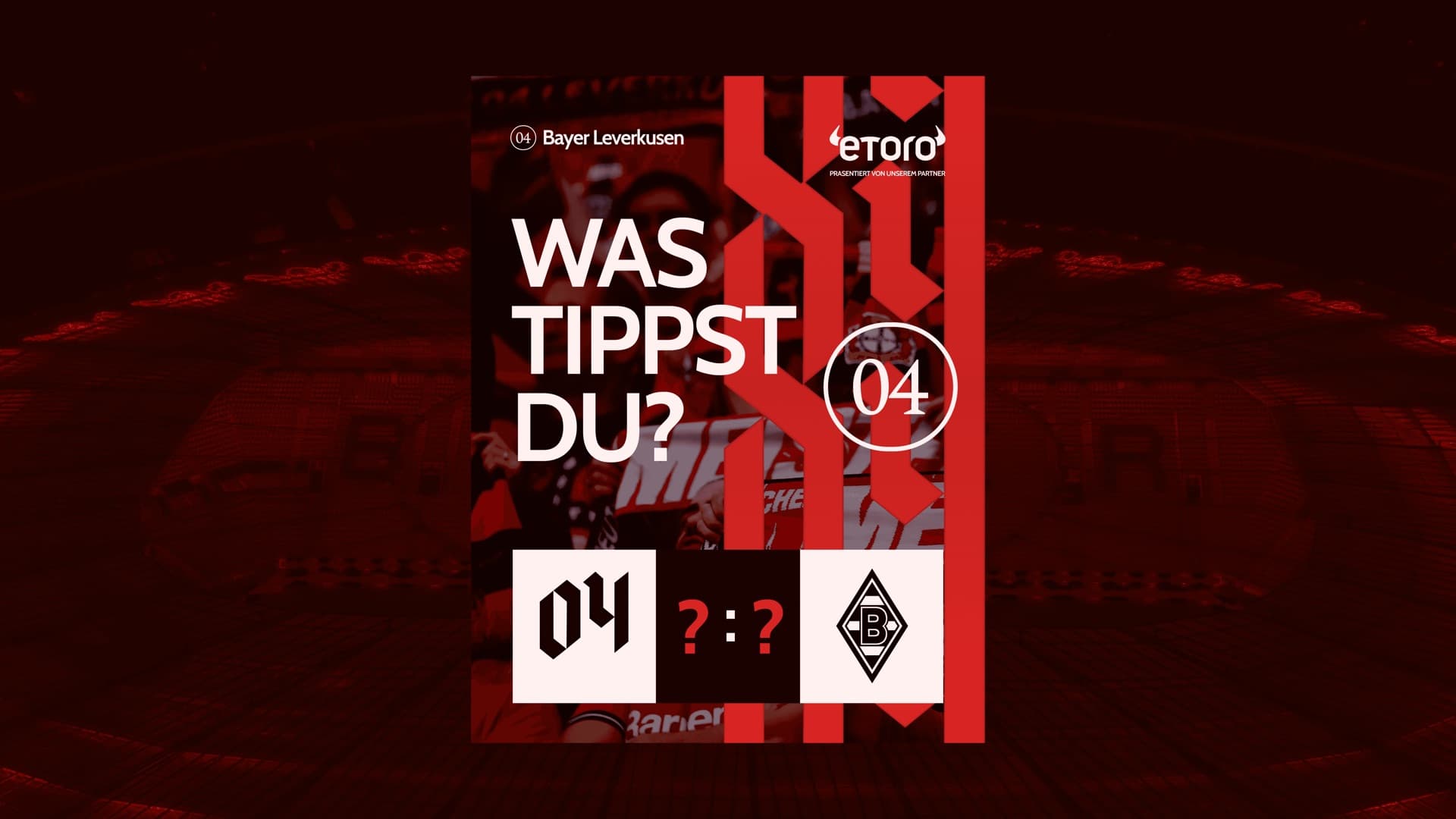
The identity seamlessly extends to brand touchpoints, maintaining consistency and elevating fan experience at every level.
- Matchday experience: The kits, stadium visuals, and environmental graphics create an immersive brand world.
- Digital expansion: The bold, clean system adapts fluidly across social media, broadcast, and mobile.
- Brand partnerships: The visual language creates premium co-branding opportunities with sponsors like eToro and Barmenia.
Delivered a refined visual identity that resonates with fans and establishes a more impactful presence in digital and global markets.
Conclusion
The brand system unifies Bayer Leverkusen's rich history with a forward-looking identity that works across every touchpoint. From matchday kits to social media, every element carries the club's spirit — bold, rooted, and ready for the global stage.