Bayer Leverkusen - Concepts
Tools: Adobe Suite
Introduction:
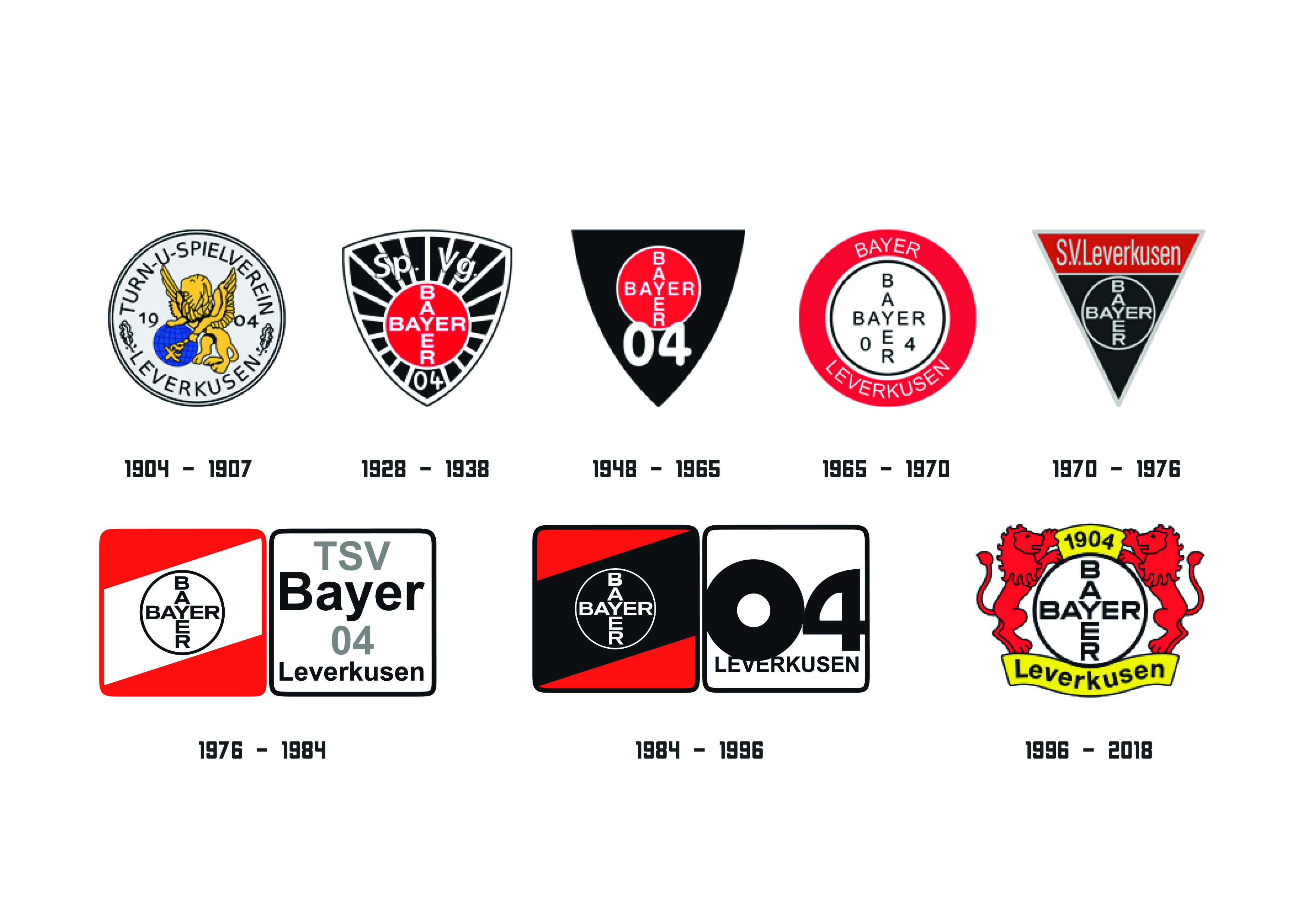
The redesign project for Bayer 04 Leverkusen's visual identity aimed to modernize and strengthen the club's brand image while preserving its authentic, traditional essence. As a team with a rich history in the Bundesliga, Bayer Leverkusen needed a visual identity that honored its legacy yet adapted to contemporary design standards, appealing to both long-time fans and newer generations. The redesign also had to ensure versatility across multiple platforms and media, from merchandise to digital channels and social media.
Challenge:
The main challenge was balancing the respect for Bayer Leverkusen's historic values with the need for a fresh, relevant design in today’s football landscape. This required retaining iconic brand elements — such as the red and black colors and the emblematic crest — while introducing new typography, palettes, and graphic elements that would make the visual identity more impactful and adaptable to the digital era. It was essential to ensure that the redesign would convey the team’s strength and competitiveness without alienating loyal fans.
Solution:
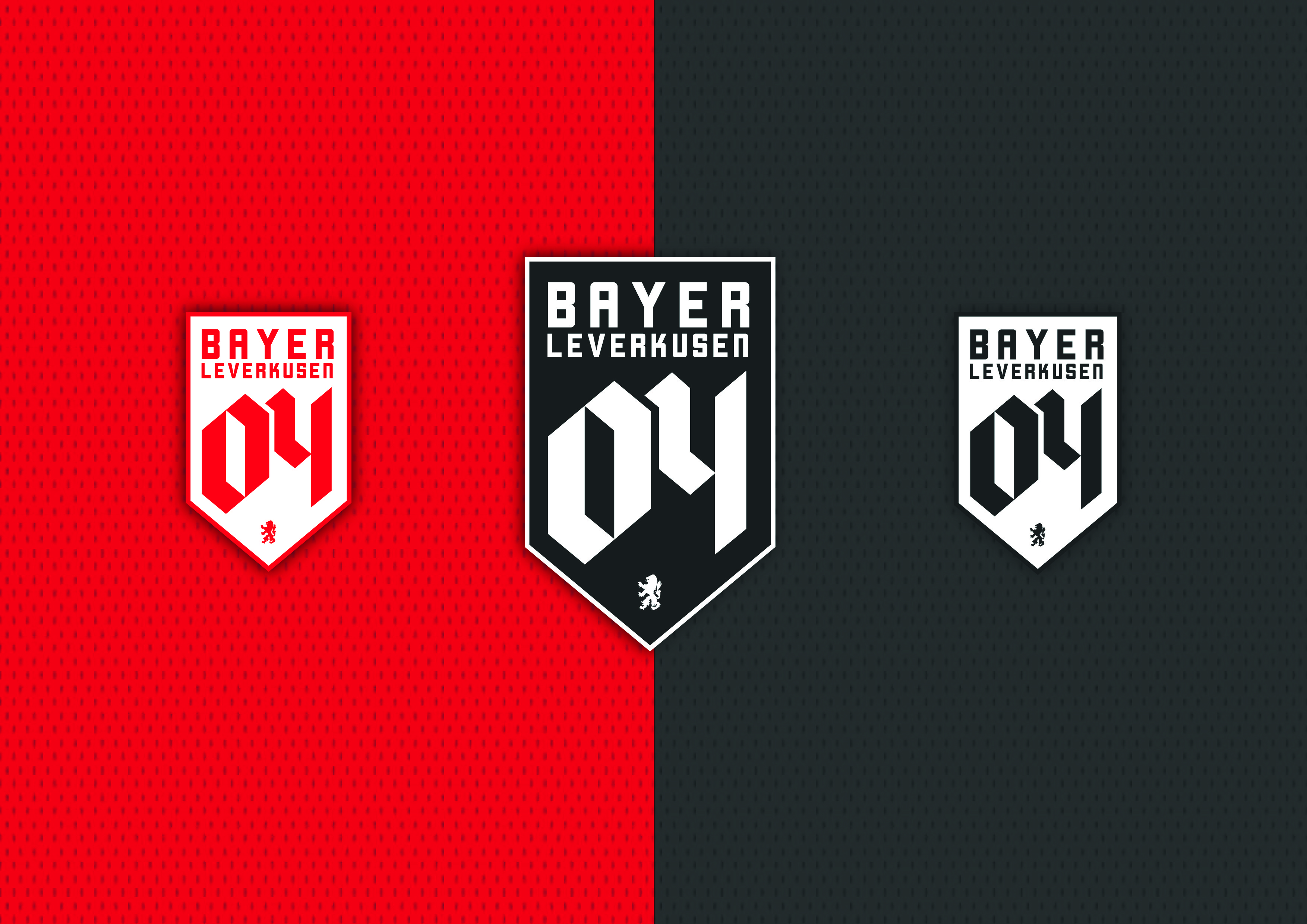
To achieve this balance, the redesign focused on modernizing the crest and typography while maintaining a connection to Bayer Leverkusen's legacy. Key elements of the crest were simplified to make it more recognizable and effective in smaller digital formats, such as social media icons and mobile applications. Additionally, a refined color palette and a set of bold, dynamic fonts were introduced to convey the club's energy and dynamism. This renewed identity not only reinforces the bond with current fans but also positions Bayer Leverkusen as an innovative brand within the football world.


